"Most users never open your site on a laptop. This guide compares mobile-only design and responsive design, explains why mobile-first is no longer optional, and covers the UX patterns that convert in 2026."
Key Takeaways
1Mobile-only design means building for phones first, not shrinking desktop layouts later.
2Navigation must be reachable using one hand — thumb zone placement beats top nav.
3Images and assets should be optimized for real mobile networks, not lab conditions.
4Forms should be short and easy to complete on small screens — fewer fields, bigger inputs.
5Mobile performance directly affects search visibility: Google uses mobile-first indexing.
For many years, websites were designed for large screens and then adjusted for phones. This approach no longer works. Today, most visitors will only see your website on a mobile device.
When businesses treat mobile as a secondary experience, users feel it immediately. Text feels cramped. Buttons are hard to tap. Navigation feels frustrating. These small issues add up and cause users to leave.
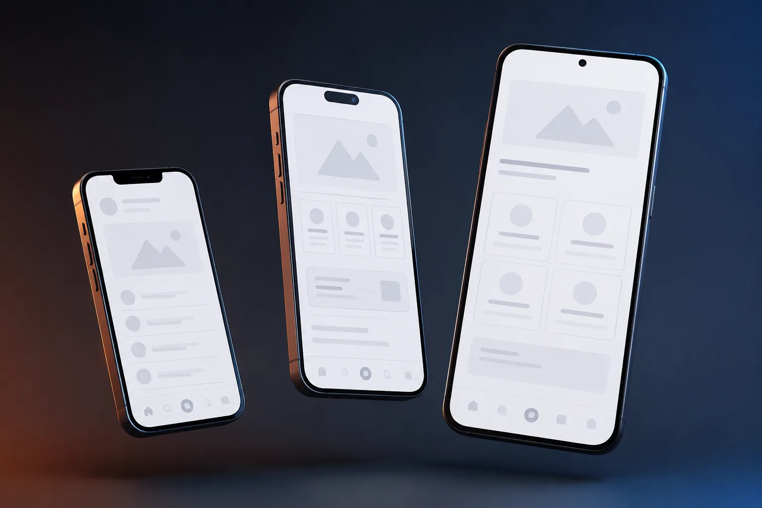
Mobile is not a smaller version of your website. It is the main version. Everything else is secondary.
Why Mobile Behavior Is Different
Mobile users browse differently. They scroll faster, skim content, and make quicker decisions. They often use one hand while walking, waiting, or multitasking.
Designing without considering these behaviors leads to poor engagement. Mobile design must reduce effort at every step.
Navigation Must Match Hand Movement
Large phones make top navigation hard to reach. Placing important actions at the bottom improves usability.
Many successful apps place navigation near the thumb zone. Websites should follow the same logic for calls, quotes, and contact actions.
Speed Is Even More Critical on Mobile
Mobile networks vary in quality. Heavy images and scripts slow down loading and frustrate users.
Compressing images, reducing scripts, and limiting animations improve reliability across devices.
Is your website losing customers?
Stop losing customers to competitors. Check your website score now and get a free optimization report.
Check your score
Designing Forms for Thumbs
Typing on mobile is slower and error prone. Long forms discourage completion.
Reducing required fields and using appropriate input types improves submission rates.
Readable Content on Small Screens
Small text strains the eyes. Larger fonts and proper spacing improve readability.
Content should be broken into short sections with clear headings to support scanning.
Mobile Only Thinking Changes Priorities
When teams design for mobile first, they focus on essentials. Unnecessary elements get removed.
This clarity often improves the desktop experience as well.
Mobile Experience Is Business Experience
If your mobile website feels slow or difficult, users assume the business operates the same way.
Designing for mobile only is no longer optional. It is the baseline for modern websites.
Want this done for you?
Get a free, no-pitch plan for your site.
Tell us where to send it. Bhavesh, the founder, reviews every request himself and replies within 24 hours, often the same day. Most sites ship in about 7 days.
Frequently Asked Questions
What does mobile-only design mean?
Mobile-only design means the website is conceived and built for phone screens first, with desktop treated as a secondary experience. Unlike responsive design — which adapts a single codebase to all screen sizes — mobile-only design starts with the smallest, most constrained viewport and optimizes every element (navigation, typography, CTAs, forms) specifically for touch interaction and one-handed use. The result is a phone experience that feels native rather than adapted.
What is the difference between mobile-only design and responsive design?
Responsive design uses flexible CSS grids and media queries so one codebase rearranges itself across screen sizes. Mobile-only design is a philosophy: you design and prioritize the phone experience first, then extend to larger screens. Responsive design is the technical implementation; mobile-only is the design methodology. Many modern websites are both — built responsively, but designed with a mobile-first mindset. The key difference is whether the designer started with a phone screen or a 1440px desktop mockup.
Is responsive design enough in 2026?
Responsive design is necessary but not sufficient. A responsive site that was designed desktop-first still produces a poor mobile experience: small tap targets, navigation that requires precise finger placement, forms with too many fields, and content hierarchy built for large screens. Google's mobile-first indexing means your mobile version is what gets crawled and ranked — so if your 'responsive' site has a weak mobile experience, your rankings suffer. Mobile-only design thinking, applied within a responsive framework, is the correct approach for 2026.
Is mobile traffic really that high?
Yes — and it has been the majority for years. Globally, mobile devices account for approximately 60–65% of all web traffic. For service businesses, local businesses, restaurants, and e-commerce, mobile share often exceeds 70–75%. Even in B2B, initial research regularly happens on mobile before decision-makers switch to desktop for deeper evaluation. Designing for desktop first and adjusting for mobile means optimizing for the minority experience first.
Do B2B buyers browse on mobile?
Yes. B2B purchasing research increasingly starts on mobile. Google data shows more than 50% of B2B search queries come from smartphones. Buyers use mobile for initial discovery, competitor comparison, and content consumption — then move to desktop to complete forms, review contracts, or make final decisions. A poor mobile experience during discovery eliminates your brand from consideration before a desktop visit ever happens.
What is the thumb zone?
The thumb zone is the area of a smartphone screen that can be comfortably reached with one thumb during one-handed use. On a typical large phone, the bottom third of the screen is easily reachable; the top third requires repositioning the hand or using the other hand. Mobile-first design places primary navigation, CTAs, and key interactions in the thumb zone — not in the top corners. Apps like Instagram, Spotify, and Gmail have moved their core navigation to the bottom for exactly this reason.
Why is bottom navigation important in mobile design?
Bottom navigation places the most-used actions within thumb reach without requiring hand repositioning. For websites, this means anchoring CTAs (call buttons, chat widgets, quote buttons) near the bottom of the viewport rather than in the header. Studies show bottom-positioned CTAs on mobile convert measurably higher than header-positioned equivalents because they eliminate the stretch gesture. For apps, bottom tab bars have become the standard navigation pattern precisely because they match natural thumb movement.
Should desktop design be ignored?
No — desktop still matters, especially for B2B, SaaS, and high-consideration purchases. The mobile-first principle means you design the mobile experience before the desktop experience, not instead of it. The constraint of a small screen forces clarity: you must decide what is most important. That clarity almost always improves the desktop version too. Design mobile first, then expand — not the other way around.
Does Google index mobile versions first?
Yes. Google has used mobile-first indexing as its default since 2019 and rolled it out to all sites by 2021. This means Googlebot primarily crawls and evaluates the mobile version of your website to determine rankings. If your mobile site has less content, slower performance, or different structured data than your desktop site, your rankings reflect the weaker mobile version. Every piece of content, schema markup, and internal linking that exists on desktop must also be present on mobile.
Is hiding content on mobile bad for SEO?
Content hidden behind tabs, accordions, or CSS display:none on mobile used to be a concern — Google historically gave less weight to hidden content. Google's current guidance is that hidden content is indexed, but it may receive less weight than prominently visible content. For AEO (Answer Engine Optimisation) and AI search citability, hidden content is particularly problematic: AI crawlers like GPTBot and ClaudeBot parse HTML but may not execute JavaScript interactions that reveal hidden content. Keep important content visible in the HTML.
Are hamburger menus still useful on mobile?
Hamburger menus are still widely used but have a usability cost: they hide navigation behind a tap, reducing discoverability. Research consistently shows that visible navigation (bottom tabs, persistent links) outperforms hidden hamburger menus for engagement. Hamburger menus are acceptable for secondary navigation with many items, but primary actions — contact, pricing, services — should be visible without requiring the menu to open.
How important is font size on mobile?
Critical. Google specifically flags text smaller than 12px as a mobile usability issue in Search Console. Apple's Human Interface Guidelines recommend a minimum of 17px for body text; Google's Material Design recommends 16px. Small text on mobile causes users to pinch-zoom, which breaks layout flow and signals a poor mobile experience. In practice, 16–18px body text with 1.5–1.7 line height is the standard for comfortable mobile reading.
What is a good button size for mobile?
Apple's guidelines recommend a minimum tap target of 44×44 points; Google's Material Design recommends 48×48dp. In practical CSS, buttons should be at least 48px tall with sufficient padding. Buttons that are too small cause tap errors — users miss and accidentally activate adjacent elements, which creates frustration and erodes trust. Full-width CTA buttons (100% container width) perform well on mobile because they maximize tap target size and visual prominence.
Should images be different on mobile?
Yes — both in format and in composition. On mobile, images should be served at the appropriate resolution for the device (not a 2000px image scaled down in CSS, which wastes bandwidth). Use responsive image techniques: srcset and sizes attributes, or Next.js Image component, to serve appropriately sized images per breakpoint. Compositionally, images cropped for landscape desktop displays often crop poorly on portrait mobile viewports — art direction (different image crops per breakpoint) significantly improves mobile presentation.
Is AMP still relevant?
No — AMP (Accelerated Mobile Pages) has been deprecated as a Google ranking signal and its special treatment in search results (the AMP carousel) was removed in 2021. Core Web Vitals (LCP, INP, CLS) have replaced AMP as Google's performance standard. If your site achieves strong Core Web Vitals scores through proper optimization (next-gen images, minimal blocking scripts, server-side rendering), you get the same ranking benefit without the AMP constraints. Build fast natively; don't use AMP.
Does mobile speed affect conversions?
Yes — dramatically. Google's research shows that as page load time increases from 1 to 3 seconds, mobile bounce rate increases by 32%. At 5 seconds, bounce rate increase is 90%. Portent's research found conversion rates are highest at 1-second load time and drop consistently with each additional second. For mobile specifically, users are often on cellular networks with variable quality — a site that loads in 1.5 seconds on Wi-Fi may take 4 seconds on 4G. Lighthouse Performance scores above 90 are the minimum acceptable standard.
How many form fields should mobile forms have?
As few as possible — ideally 3–5 fields for a lead generation form. Every additional field on mobile reduces completion rate. Expedia famously found that removing one field (company name) from their booking form increased annual revenue by $12 million. On mobile, typing is difficult, autocorrect creates errors, and attention is limited. Ask for the minimum: name, email or phone, and a brief message. Collect additional information after conversion.
Is horizontal scrolling bad on mobile?
Yes — unintentional horizontal scrolling is a critical mobile usability error. It usually means content or an element is wider than the viewport, forcing users to scroll horizontally to see all content. This is typically caused by fixed-width elements, images without max-width:100%, or tables wider than the screen. Google flags horizontal scrolling as a mobile usability issue in Search Console, and it directly harms Core Web Vitals CLS scores. Fix all overflow:hidden violations and test on real devices.
Should phone numbers be clickable on mobile?
Yes — always. Phone numbers on mobile websites should be wrapped in a tel: link so tapping them initiates a call directly. In HTML: <a href='tel:+15551234567'>+1 555 123 4567</a>. This removes friction from the most high-intent action a local business visitor can take. Many WordPress and page builder sites render phone numbers as plain text, making them impossible to tap-to-call. This is one of the highest-impact quick wins for mobile conversion rate optimization.
Does mobile UX affect brand trust?
Yes — significantly. A slow, cramped, or visually broken mobile experience signals to users that a business does not invest in quality. Stanford's Web Credibility Research found that 75% of users judge a company's credibility based on website design. On mobile, where the experience is more intimate and the screen real estate is limited, poor UX is more immediately obvious. First impressions happen within 50 milliseconds — a mobile site that renders poorly in that window loses the user before they read a single word.
Can mobile design improve SEO?
Yes — mobile design improvements directly affect SEO through multiple mechanisms: Core Web Vitals (LCP, INP, CLS) are ranking signals and are measured on mobile; Google's mobile-first indexing means your mobile content determines rankings; mobile usability issues (small text, clickable elements too close together, viewport not configured) are flagged in Search Console and can suppress rankings; and page speed, which is critical on mobile cellular connections, is a ranking factor. Every point improvement in Lighthouse Performance score on mobile has a measurable SEO impact.
Is responsive design enough?
Responsive design (adapting one codebase to all screen sizes via CSS media queries) is the correct technical approach, but it is not enough on its own. Responsive design handles layout reflow — it does not guarantee a good mobile experience. A responsive site designed desktop-first typically still has navigation requiring two-handed use, CTAs in hard-to-reach positions, images cropped for landscape viewports, and content hierarchy built for large screens. The combination of responsive implementation with mobile-first design thinking is the 2026 standard.
What is mobile-first indexing?
Mobile-first indexing is Google's default crawling and ranking methodology, active since 2019. Googlebot's primary crawler is a mobile smartphone user agent — it renders and evaluates the mobile version of your page to determine content, structured data, and quality. If your desktop and mobile versions differ (different content, different structured data, different internal links), your rankings reflect the mobile version. Pages with strong desktop experiences but weak mobile experiences rank based on the weaker mobile version. This is why mobile-first design is not optional — it is directly tied to search visibility.
Should popups be avoided on mobile?
Intrusive interstitials (popups that cover the main content) on mobile are a direct Google ranking penalty risk. In 2017, Google introduced a specific signal penalizing pages where content is not immediately accessible due to popups. Small banners, cookie consent notices, and age verification dialogs are exempt — but full-screen popups that appear immediately on page load can result in ranking suppression. Beyond rankings, popups on mobile have significantly lower engagement rates than on desktop because they are harder to dismiss and more disruptive to the reading flow.
Is one-handed usage common on mobile?
Yes — studies show approximately 49% of smartphone users hold their phone with one hand and operate it with one thumb exclusively. Another 36% cradle the phone in one hand and tap with the index finger of the other. Only 15% use both thumbs. This means the majority of mobile users have limited reach to the top of the screen during typical use. The implications for design are direct: navigation, primary CTAs, and key interactive elements should be positioned in the lower half of the screen.
Do mobile users scan more than desktop users?
Yes. Nielsen Norman Group's eye-tracking research shows mobile reading patterns are more fragmented than desktop — users scan in an F-pattern or spot pattern, fixating on headings and the first words of paragraphs. On mobile, the narrower viewport means users see fewer words per line and scroll more frequently. Content for mobile should: use short paragraphs (2–3 sentences), front-load key information in the first sentence of each paragraph, use subheadings every 150–200 words, and avoid dense blocks of text.
What is the biggest mobile design mistake?
Designing for desktop first and then shrinking it to fit a phone screen. This approach produces mobile layouts that are technically functional but experientially poor: navigation built for hover states instead of tap, CTAs sized for cursor precision instead of thumb pads, content hierarchy optimized for widescreen left-to-right reading, and images cropped for landscape rather than portrait. The fundamental constraint of mobile — a small, touch-driven, portrait-orientation screen held in one hand — requires a different design starting point, not a design adaptation.
Founder & CEO of FactoryJet, a web design and e-commerce agency serving 500+ US, UK, and UAE businesses. Expert in small business website strategy, Shopify development, and Core Web Vitals optimization.