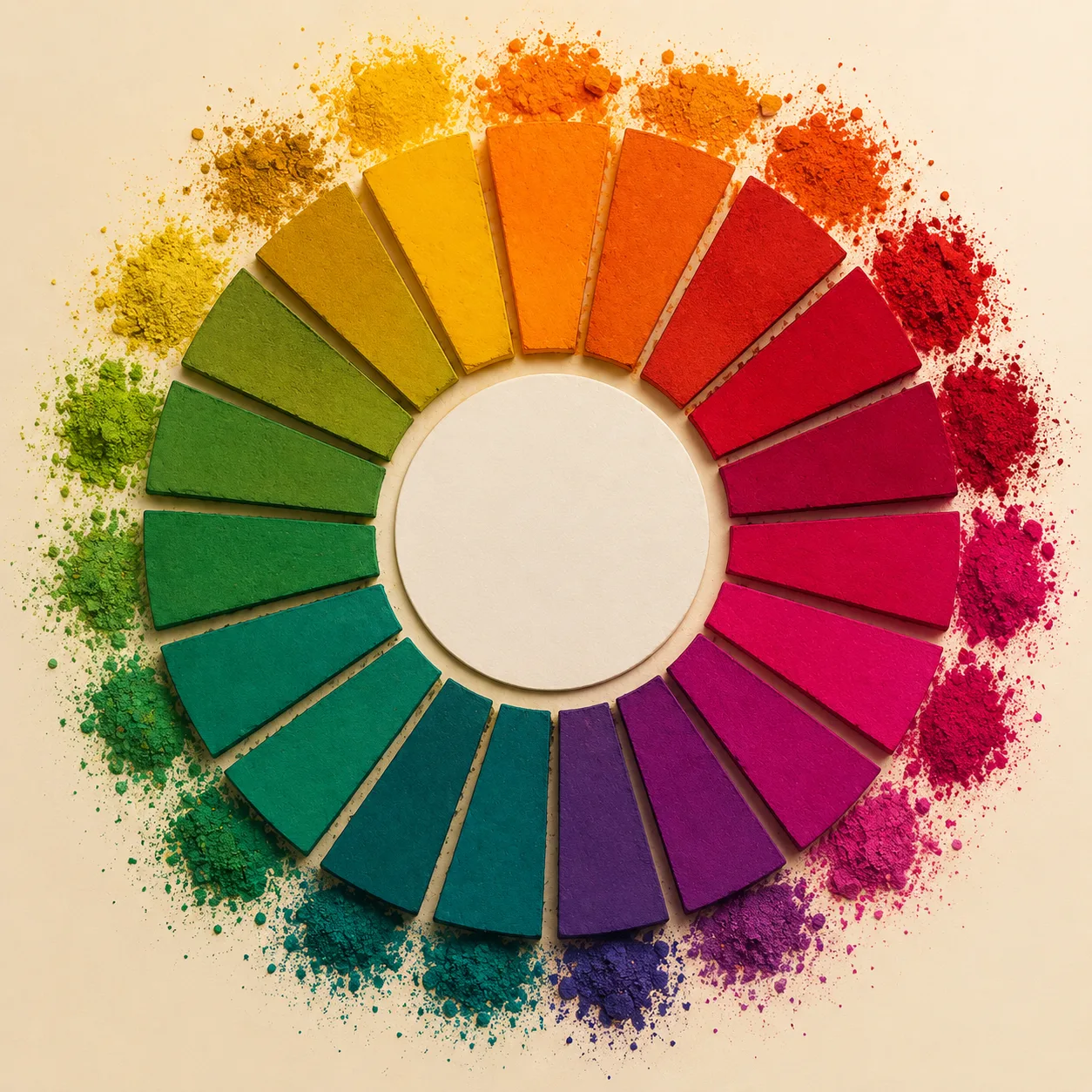
"Color decisions in Indian digital products are not just visual choices. They influence trust, emotion, and buying behavior in ways that differ sharply from Western markets."
Key Takeaways
- 1Color perception in India is shaped by culture, religion, and daily context.
- 2Red can signal celebration or urgency depending on usage.
- 3Blue is strongly associated with trust, stability, and institutions.
- 4Green connects with growth, money, and agriculture driven optimism.
- 5White space communicates clarity, premium value, and confidence when used well.
Color is one of the first things users notice when they open a website or app. It sets expectations before a single word is read. In Indian ecommerce, color choices play an even bigger role because they interact with deep cultural meanings, habits, and emotional associations.
Many global design guidelines are written with Western users in mind. When these same palettes are applied directly to Indian audiences, the results are often mixed. What feels clean and neutral in one culture may feel cold, untrustworthy, or confusing in another.
Designing with color in India is not about decoration. It is about understanding how people feel, decide, and trust.
Why Color Is Never Neutral
Color is processed emotionally before it is processed logically. Users do not consciously analyze why a screen feels trustworthy or stressful. They just react.
In India, color meanings are reinforced daily through festivals, clothing, religion, politics, and advertising. These associations do not disappear when users open an app.
Ignoring this context leads to interfaces that feel foreign or uncomfortable.
Red in Indian Ecommerce
Red is one of the most powerful colors in Indian culture. It represents celebration, marriage, energy, and urgency.
This makes red extremely effective for clearance sales, discounts, and limited time offers. Users associate it with action and excitement.
However, red also signals danger and error in UI conventions. Using it excessively or in the wrong context can reduce trust, especially in finance or healthcare products.
Why Blue Dominates Trust Based Products
Blue has become the default color for trust across digital products in India. Banks, insurance companies, government portals, and enterprise tools all rely heavily on blue.
It communicates calm, authority, and reliability. Users subconsciously associate blue with safety and professionalism.
For products handling money or sensitive data, blue reduces anxiety and increases confidence.
Green and Its Financial Meaning
Green has strong positive associations in India. It is linked to growth, prosperity, agriculture, and money.
This makes green a natural choice for fintech, investment platforms, and success states like payments completed.
Green works especially well when paired with neutral backgrounds to avoid visual overload.
The Role of White Space
White space is often misunderstood in the Indian market. Some assume it means wasted space or missing content.
In reality, white space communicates confidence and clarity. Premium brands use it to reduce noise and guide attention.
When used correctly, white space improves readability and perceived quality.
Orange as a Middle Ground
Orange sits between red and yellow in emotional intensity. In India, it represents energy, affordability, and action.
Ecommerce platforms often use orange for primary CTAs because it feels inviting rather than aggressive.
It performs well for mass market products where approachability matters.
Yellow and Attention
Yellow attracts attention quickly, but it can also cause visual fatigue if overused.
In Indian design, yellow works well for highlights, badges, and supportive accents.
It should rarely be used as a primary background color for long content.
Black and Luxury Positioning
Black communicates sophistication and exclusivity. Luxury ecommerce brands often use black with restrained typography.
However, black can feel heavy and unapproachable for mass audiences.
It works best when the brand story supports a premium narrative.
Mobile Context Changes Everything
Most Indian users access ecommerce through mobile devices. Small screens amplify color choices.
High contrast is essential for outdoor usage where glare is common.
Subtle color differences that work on desktop may disappear on mobile.
Color and Accessibility
Color should never be the only way information is conveyed. Error states, success messages, and alerts need text or icons as well.
Good contrast ratios are critical for readability, especially for older users.
Accessibility is not a compliance issue. It is a usability issue.
Festival Driven Color Changes
Indian ecommerce often adapts color themes during festivals. This creates emotional relevance and urgency.
However, these changes should be temporary and controlled.
Permanent festival palettes can dilute brand identity.
Consistency Builds Trust
Frequent color changes confuse users. Consistency helps users build familiarity with the interface.
When colors behave predictably, users feel in control.
This is especially important for repeat purchases.
Avoiding Over Decoration
Indian design is sometimes stereotyped as loud or overly vibrant. This is not always true.
Modern users value clarity and speed more than decoration.
Restraint often performs better than excess.
Brand Identity Over Trends
Following color trends without understanding brand positioning leads to inconsistency.
A strong brand uses color deliberately and consistently.
Trends should influence execution, not identity.
Color psychology in Indian ecommerce is about balance. Cultural familiarity, usability, and brand intent must work together. When color choices respect context and user expectations, they quietly increase trust and conversions without ever drawing attention to themselves.
Is your website losing customers?
Stop losing customers to competitors. Check your website score now and get a free optimization report.
Want this done for you?
Get a free, no-pitch plan for your site.
Tell us where to send it. Bhavesh, the founder, reviews every request himself and replies within 24 hours, often the same day. Most sites ship in about 7 days.
Frequently Asked Questions
Does color really affect conversion rates?
Is color psychology different in India compared to the West?
Why is red so common in Indian ecommerce?
Can red hurt trust in some products?
Why do banks prefer blue?
Is green a good color for fintech apps?
What does white space communicate?
Is dark mode better for Indian users?
Do rural and urban users perceive colors differently?
Does orange work well in India?
Is yellow risky to use?
How important is contrast for accessibility?
Should brands localize colors for India?
Does color affect brand trust?
Can too many colors hurt UX?
Is minimal color usage better?
Do festival themes boost engagement?
Should CTA buttons always be bright?
Is black suitable for ecommerce?
Does color impact mobile UX more?
What about accessibility for color blind users?
Can color influence perceived pricing?
Should startups follow big brand color trends?
Is consistency more important than experimentation?
Do Indians prefer vibrant designs?
Can poor color choices increase bounce rate?

Bhavesh Barot
Founder & CEO
Founder & CEO of FactoryJet, a web design and e-commerce agency serving 500+ US, UK, and UAE businesses. Expert in small business website strategy, Shopify development, and Core Web Vitals optimization.